Create a bar/pie of pie chart for an excel report
This graph is very useful when I need to show side by side the total product and the sub-total of a particular product. It allows me to emphasize one aspect of my report so telling to my customer to focus particularly in this section.
I remember that when I did it the first time, it was not easy to understand, even looking into internet, I couldn’t find the right explanation and at the end, by guessing and testing, I found out the how to.
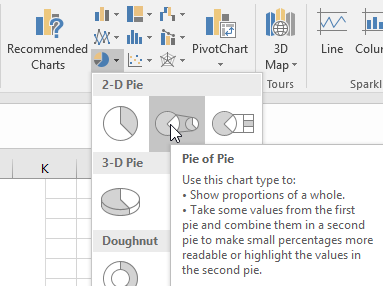 |
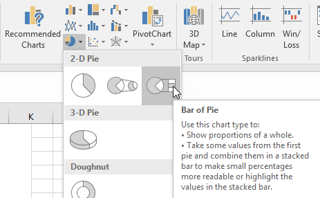 |
I will explain the pie of pie graph because the bar of pie chart works the same way. Imagine that I have those data:
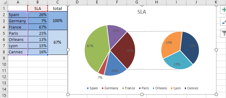
And I want to show on the left side, the countries and on the right side, the French cities so if I am selecting all data of the column A and B, I got the chart above.
As you can see, the “France” data is showing twice and it is something that I don’t want. By selecting the same data but without the row 4 (the France one), I got almost the correct chart but at least, France is not duplicate anymore.
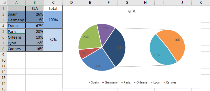
To have all the cities on the right side, I have to right click on the pie and select the “format data series” option:
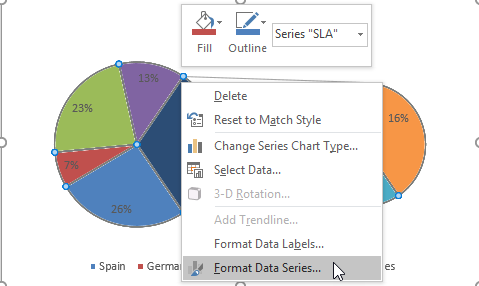
I will get this panel and on the “values in second plot” field, I will put “4”:
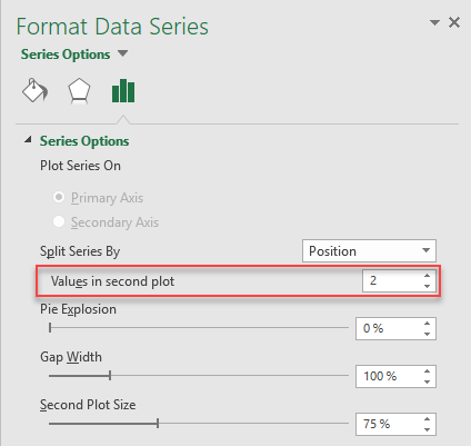 |
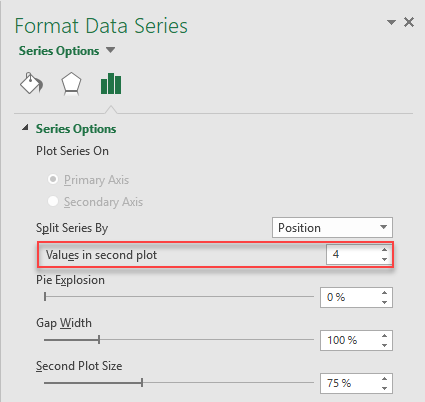 |
Automatically, the chart will be updated and now, I have the correct graph:
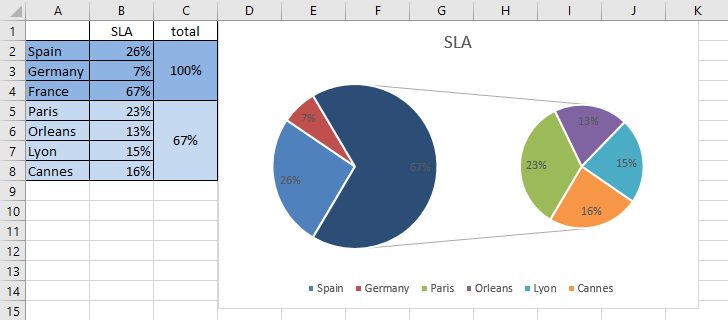
As you can see, it is not complicated but may be I am not smart enough to understand quickly how to create this kind of charts :-)
Interesting Topics
-

Be successfully certified ITIL 4 Managing Professional
Study, study and study, I couldn’t be successfully certified without studying it, if you are interested...
-

Be successfully certified ITIL 4 Strategic Leader
With my ITIL 4 Managing Professional certification (ITIL MP) in the pocket, it was time to go for the...
-

Hide visual and change background color based on selection
Some small tricks to customize the background colour of a text box...
-

Stacked and clustered column chart or double stacked column chart
In excel, I use a lot the combination of clustered and stacked chart...


