Customize colors and forms of a radar chart in an excel report
There are many chart options in excel but one day, I had to use the radar one and excel proposes 3 options: the simple one, the radar with markers and the filled radar. The most inconvenient, for me, is the color, particularly when I used the filled radar because it will fill up and merge automatically the same color for my different values.
It doesn’t mean that there is not a way to personalize the form and the color for each value but I have to trick excel. In fact, I started first to look in internet if someone had the same issue like me, more importantly, if the chart I wanted, someone had done it already. Unfortunately, no one or at least, I didn’t find anything but based on what I read, at the end, and with a little guess, I found how to do it.
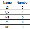
To explain better, I will use those data:
So if I select the filled radar, excel will display the chart:
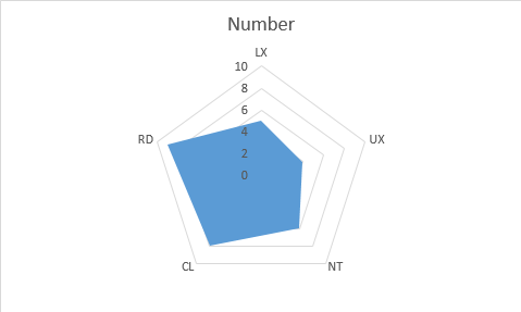
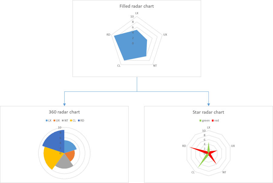
All names have the same color, and with the different configuration options, there is no way to put different colors for LX, UX, NT, CL and RD. To do that, I will describe 2 options that I use the most, the 360 radar chart (it can be found in internet) and the star radar chart (my own creation).
The 360 radar chart
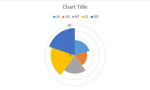
It is to represent it in 360 degrees, in fact, each name will take 1 portion of the 360 degrees so excel will show a different color for each name. First, I have to extend the table like this from the column A to NC; just take note that from the column G to NC, I put 0, 1, 2, 3, 4, etc. until 360:
 |
 |
- In the “sector” column, put 1 for all cells
- In the “% 360 degrees” column, in the cell D2, put this formula then copy it to the below cells: =C2/SUM($C$2:$C$6)
- In the “start angle” column:
o In the cell E2, put 0
o In the cell E3, put =F2 (referencing to the second cell of the “end angle” column) then copy it to the below cells - In the “end angle” column, in the cell F2, put this formula then copy it to the below cells: =360*SUM($D$2:D2)+1
- In the “0” column:
o In the cell G2, put this formula then copy it to the below cells: =IF(AND(G$1>=$E2,G$1<=$F2),$B2,0)
o Then select all cells except G1 of this column, copy them and paste them to all empty cells until the last column which is the “360” column
o In the cell G6, put =NC6 (referencing to the last cell of the “360” column)
Once all cells are filled, select the data as shown below then create the filled radar.
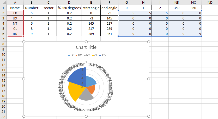
To delete the annoying numbers in circle, just click anywhere in the “circle” then delete it so the chart will display like this:
The star radar chart
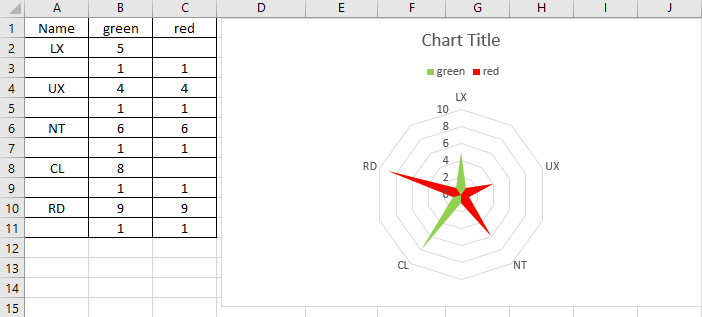
For this chart, I need to duplicate each name and to reference the column with a color. I can put many colors I want but for this example, I will just take 2 colors. My table will look like this:
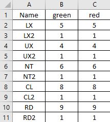
And I will create the filled radar chart and now I will:
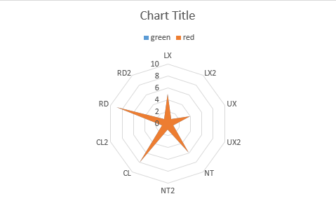
- In the chart, change the blue color to green (just select the “green” legend then right click to select “format legend entry”) and the orange one to red
- In the table, delete the duplicate names so in the chart, the duplicate ones will not appear
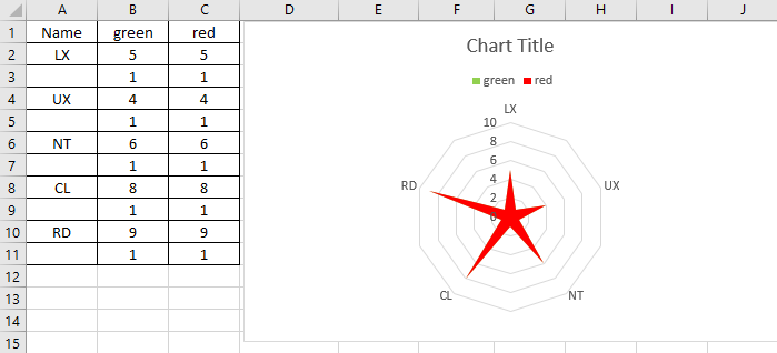
Imagine that I want to have LX and CL in green and the rest in red, from the table, I will delete the number in red for LX and CL:
Interesting Topics
-

Be successfully certified ITIL 4 Managing Professional
Study, study and study, I couldn’t be successfully certified without studying it, if you are interested...
-

Be successfully certified ITIL 4 Strategic Leader
With my ITIL 4 Managing Professional certification (ITIL MP) in the pocket, it was time to go for the...
-

Hide visual and change background color based on selection
Some small tricks to customize the background colour of a text box...
-

Stacked and clustered column chart or double stacked column chart
In excel, I use a lot the combination of clustered and stacked chart...


