Power BI: create chart in import or directquery
After loading data using the import or direct query option, I will create a chart but it is not showing exactly what I want:

To do it correctly, I will need to group the date:
- Select the date, in my example, it will be “created”
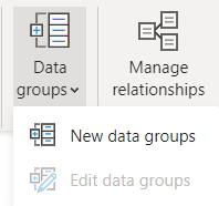
- Click on “data groups -> new data groups”

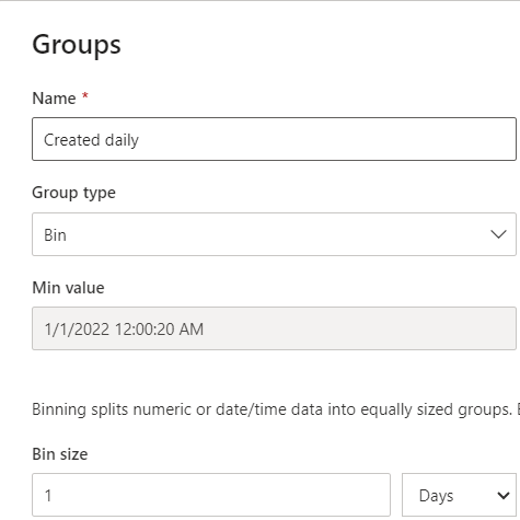
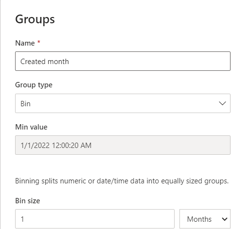
- In the popup:
- In the “name” field, if need be, change the name
- In the “bin size” field, on the left picture, I put it “daily” and on the right one, “month”
 |
 |
Now on my chart, I will remove the “created” and put “created daily”:

Let’s try with the “created month”:

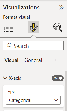
For both, much more better. The only point is the name of the day/month, it is not showing all of them, in order to make them appear correctly, go to the “x-axis” then select “categorical”.


Interesting Topics
-

Be successfully certified ITIL 4 Managing Professional
Study, study and study, I couldn’t be successfully certified without studying it, if you are interested...
-

Be successfully certified ITIL 4 Strategic Leader
With my ITIL 4 Managing Professional certification (ITIL MP) in the pocket, it was time to go for the...
-

Hide visual and change background color based on selection
Some small tricks to customize the background colour of a text box...
-

Stacked and clustered column chart or double stacked column chart
In excel, I use a lot the combination of clustered and stacked chart...
-

Refresh Power BI
From the Power BI Service, I can set refresh but, for instance, there is no option to do it monthly or each time a change is made...
-

Power BI alerts to be sent by email from an excel file based on condition
I will explain how to send a list of emails from an excel file after creating alerts...


