Power BI: create comparison chart with 1 single table
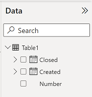
In IT, I use to have the created and closed columns in one single table:
And most of the time, I need to compare them so I can create 2 charts like that and see the difference:

But to save spaces and for a better view, I like to combine both data into 1 single chart:
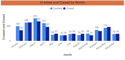
There are 2 options to get this result, the first one is to unpivot both columns. Take note that doing that, charts that you have created will be “lost” because unpivoting them will rename your columns.
- Go to the query editor by clicking on “transform data -> transform data”

- Select both columns (created and closed)
- Click on “transform -> unpivot columns”

- Once done, exit the editor by clicking on “home -> close & apply”
You will see that both columns have been renamed:
- The attribute column showing “created” and “closed”
- The value column showing the date
You can change the name of the columns if you want but for my article, I won´t. I will create 2 measures with those formula:
- One for created -> CALCULATE(COUNT('table'[argument1]),'table'[argument2] ="created")

- One for closed -> CALCULATE(COUNT('table'[argument1]),'table'[argument2] ="closed")

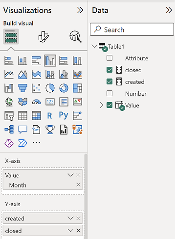
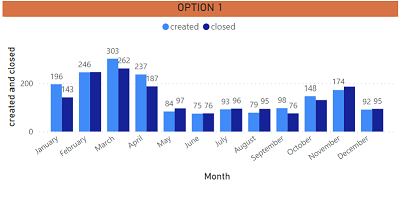
NOTE: change “table” and “argument” by yours. Once it is done, I just have to create my chart:
 |
 |
For the second option, contrary to the first one, you won´t loose any of your charts.
- Group “created” and “closed” by month
- Select the “created” column
- Click on “data groups -> new data groups”

- Change the name (if you want, here I put “created month”) and in the “bin size” field, put like in the picture
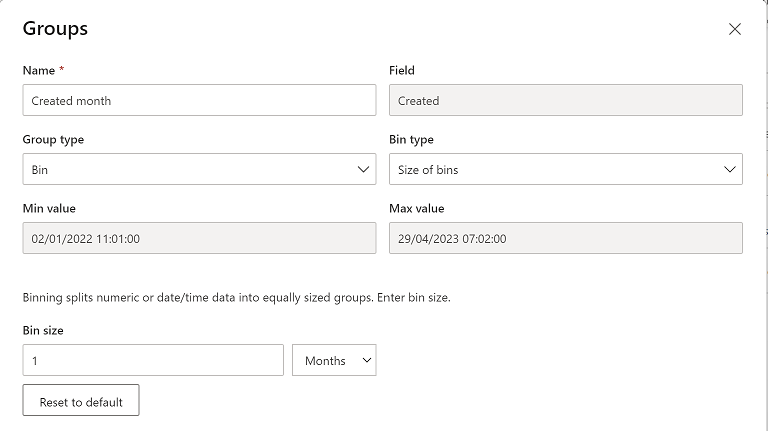
- Do the same thing for the “closed” column
- Create a calendar table (for more information, read my other article Power BI: create an automatically updated calendar)

- Create a relationship between this calendar table and both new columns (“created month” and “closed month”) by clicking on “home -> manage relationships” then “new”

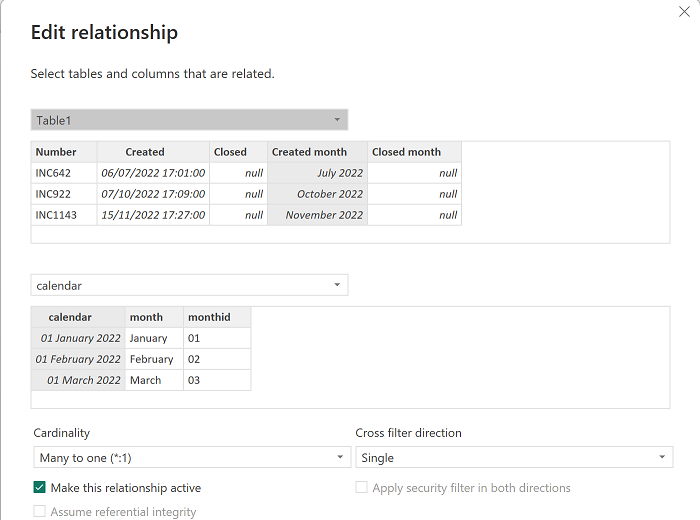 |
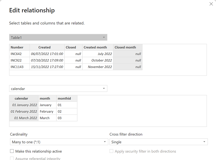 |

- Create a measure to count number of closed with this formula: CALCULATE(COUNTROWS('table1'),USERELATIONSHIP('table1'[argument1],'table2'[argument1]))

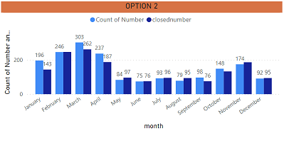
NOTE: you can use other functions than COUNTROWS, the most important is the USERELATIONSHIP (change “table” and “argument” by yours). Once it is done, I just have to create my chart:
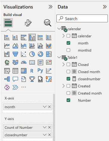 |
 |
Interesting Topics
-

Be successfully certified ITIL 4 Managing Professional
Study, study and study, I couldn’t be successfully certified without studying it, if you are interested...
-

Be successfully certified ITIL 4 Strategic Leader
With my ITIL 4 Managing Professional certification (ITIL MP) in the pocket, it was time to go for the...
-

Hide visual and change background color based on selection
Some small tricks to customize the background colour of a text box...
-

Stacked and clustered column chart or double stacked column chart
In excel, I use a lot the combination of clustered and stacked chart...


