Power BI: create, publish and update a dashboard for beginners - Part 2: create the report
This tutorial is divided in 4 parts and this article is the part 2:
- Part 1: upload the data
- Part 2: create the report
- Part 3: share with the audience
- Part 4: create the dashboard
On the “report view”, I will create some visuals like a chart, a table, a card, a slicer, etc. I will start to put a title for my report by clicking on “text box”:

In the “format text box” panel, in “effects”, I will change the background color to black. To modify its size, I can do it in “properties” or just drag the small grey lines.
NOTE: there are many options to customize the visual, just play with them
I will add a “priority” filter by clicking on “slicer” then move “priority” from “data” to the “field”:

By default, it shows as a list but I want it as a dropdown so I have to go in “format your visual -> slicer settings -> options”:
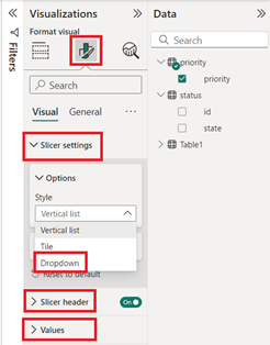 |
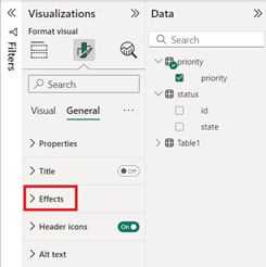 |
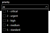
I will make other changes like putting the name in white (slicer header), in black background and white fonts for the list (values), in black the filter background (general -> effects) and its size:
I will expand the “filters” panel by clicking on the “arrow”:
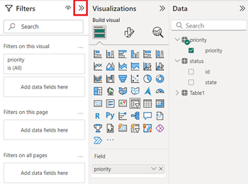
As we can see, the “priority” filter is also here so I have it twice. If I am going to share my report in internet, my users will also see both so to avoid misunderstanding, I will hide it. In fact, I can hide the full “filters” panel or only some filters. To hide the full panel, just click on the “eye” icon.
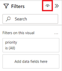 |
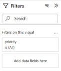 |
To keep the panel but just to hide some filters, I will move the mouse on the right corner of the “priority” filter then the “eye” icon will appear.
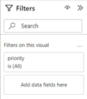 |
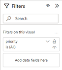 |
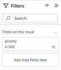 |
NOTE: for the purpose of this tutorial, I will hide the full panel and I will hide only the “priority” so you will understand better the advantage and disadvantage in the part 3.
I will create another slicer for “status” but instead to repeat the same steps, I will copy the “priority” one by selecting it then:
- Right click on the mouse

- Or “home -> copy” then “home -> paste”


In the “visualizations -> field”, I will remove “priority” by clicking on the “x” then put “state”:
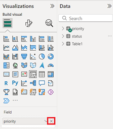 |
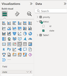 |
 |
The issue here is the order, I want “closed” to be the end instead of the top. I can sort it by descending because by default, it is ascending, it works but I have “resolved” on top now and again not what I want, I want it just before “closed”.
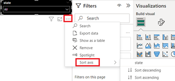 |
 |
To resolve it, if you remember, when I created the “status” table, I created an “id” column so let’s go back to the table view, I will select the “state” column then on “column tools -> sort by column”, select “id”:
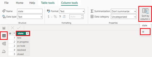
Going back to the report view and after sorting back to ascending, the order is now what I want:

I will create a column chart by clicking on the “clustered column chart” icon and by moving from “table1”, the “opened” to “x-axis” and “number” to “y-axis”:
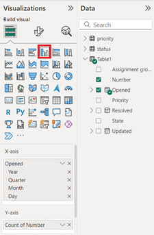
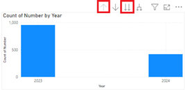
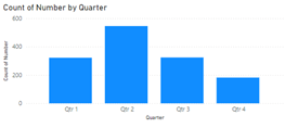
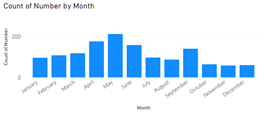
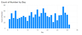
By default, the chart is showing yearly. If I move my mouse on the top right and by clicking on the “doble down arrow”, I can display either in quarter, in month or in day. To reverse, just click on the “up arrow”.
 |
 |
 |
 |
If I don’t want this option, in the “x-axis”, I just need to keep one and remove the 3 others by clicking on the “x”. For instance, I keep “month”:
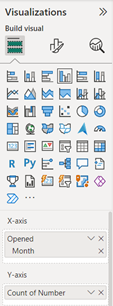
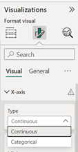
Since I will keep this option, I will need to define which one will be used as default so I will stop at the “month” view. If you decide to select “day” view, the chart shows by range of 5. If you prefer to show it daily, click on “format your visual -> x-asis” then in “type”, select “categorical”:
 |
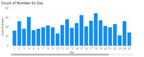 |
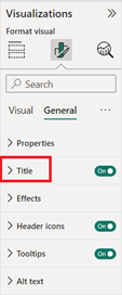
To personalize the visual, just play with the different options located in “visual” and “general”. For instance, in “visual”, I will remove the name for “x-asis” and “y-asis”, put number by turning on “data labels”. In “general”, in “title”, put a new one, centered and put grey as background.
 |
 |

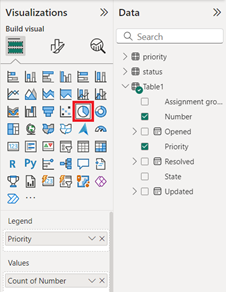
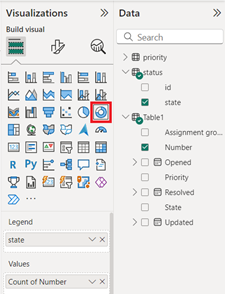
I will add a pie visual for “priority” by clicking on pie chart and from “table1”, in “legend”, put “priority” and in “values”, “number”. I will also add a donut chart for “status” and from “table1”, I will only take “number” and the “state”, I will take it from “status” table because it has the order I want. For both, I will personalize as I did for the chart column.
 |
 |
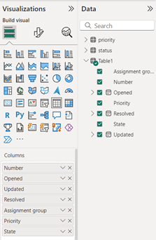
I will add a table and I will put all columns from the “table1”:
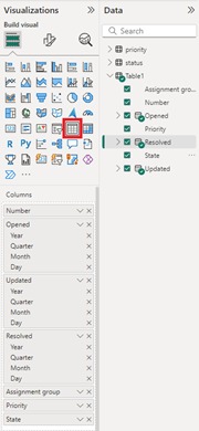
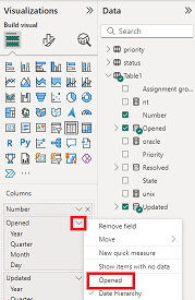
As you can see, in the visual, “opened”, “resolved” and “closed” is showing by categories and I want to show them as a date format.

In the “visualizations” panel, click on the “v” beside “x” of “opened” and select “opened”. I have to do it the same thing for “resolved” and “closed”:
 |
 |
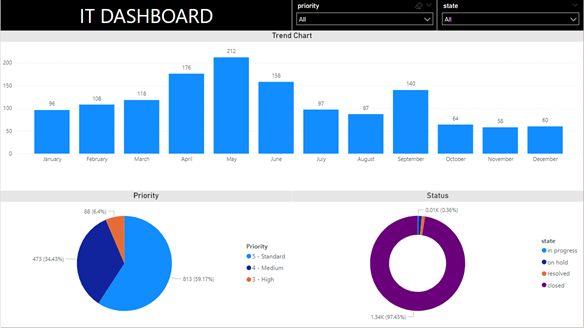
This is the result after I customized it:
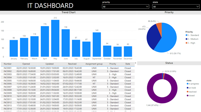
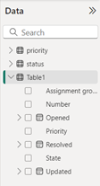
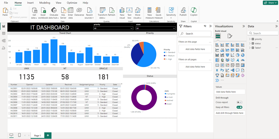
To finalize my report, I will add 3 cards to show how many incident tickets I have for each assignment group. For that, I will create 3 measures so I will click on “table1” on the “data” panel then click on “new measure” to put this formula:
 |
 |
CALCULATE(COUNT('table'[argument]),'table'[argument]="value")
NOTE: replace “table”, “argument” and “value” by yours

NOTE:
- If I want to add another criteria, I will add the AND function but I like to use the short version “&&”. For instance, I want to calculate “unix” and “P1”:
CALCULATE(COUNT('table'[argument]),'table'[argument1]="value1" && 'table'[argument2]="value2")

- If I want to include another condition, I will add the OR function and the short version is “||”. For instance, I want to calculate “unix” and “nt”:
CALCULATE(COUNT('table'[argument]),'table'[argument]="value1" || 'table'[argument]="value2")

- If I want to exclude a value, I will replace “=” by “<>”. For instance, I want to calculate everything except “unix”:
CALCULATE(COUNT('table'[argument]),'table'[argument]<>"value")

I change the name “measure” to “unix” and I will do the same thing for “nt” and “oracle”.

In the “visualizations” panel, I will click on “card” and put my “unix” measure.
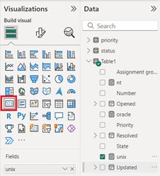
I will customize the visual and I will repeat the same process for the 2 others. This is my final result:
You just learn the way to create your report in order to publish it in internet in the next Part 3: share with the audience.
Interesting Topics
-

Be successfully certified ITIL 4 Managing Professional
Study, study and study, I couldn’t be successfully certified without studying it, if you are interested...
-

Be successfully certified ITIL 4 Strategic Leader
With my ITIL 4 Managing Professional certification (ITIL MP) in the pocket, it was time to go for the...
-

Hide visual and change background color based on selection
Some small tricks to customize the background colour of a text box...
-

Stacked and clustered column chart or double stacked column chart
In excel, I use a lot the combination of clustered and stacked chart...


