Power BI: format chart column color of single data
I will explain here how to customize the color of a specific column in the x-axis if you have only 1 single data, something like that:
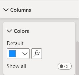
I have this simple chart:
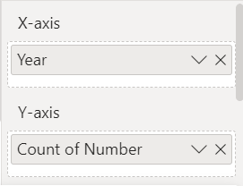 |
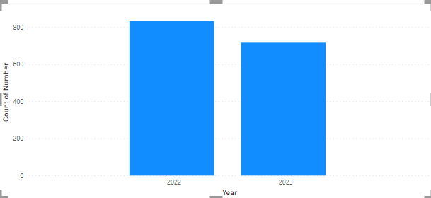 |
The first thing to do is to create a new column with this formula:
- Option 1 if a year column exists: IF(CONVERT([argument],INTEGER)=YEAR(NOW()),1,0)

- Option 2 if not exists: IF(CONVERT(FORMAT([argument],"YYYY"),INTEGER)=YEAR(NOW()),1,0)

NOTE:
- Replace “argument” by yours
- I can replace YEAR(NOW()) by 2023 for instance but I prefer this way so for a new year, I won’t have to change it
- If I have more than 2 years, change “1” by another number and add another formula by replacing “0”, for instance if I have 2021, 2022 and 2023:
IF(CONVERT([argument],INTEGER)=YEAR(NOW()),2,IF(CONVERT([argument],INTEGER)=YEAR(NOW())-1,1,0))
So 2023 = 2, 2022 = 1 and 2021 = 0.
In both formulas, I define 2023 = 1 and 2022 = 0 and I use the CONVERT function to change the “year” from text into a whole number (to know the options, refer to Microsoft webpage).
Once done, I will click on the conditional formatting “fx” and fill:
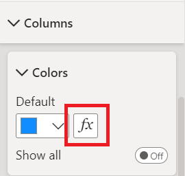
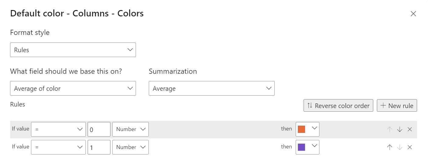
- Format style -> rules
- What field should we base this on ? -> select the new column
- Summarization -> select “minimum”, “maximum” or “average”
- Rules -> as shown in the picture (to create a new one, just click on “+ new rule”)
NOTE: “minimum” and “maximum” are best option if I have only 2 years
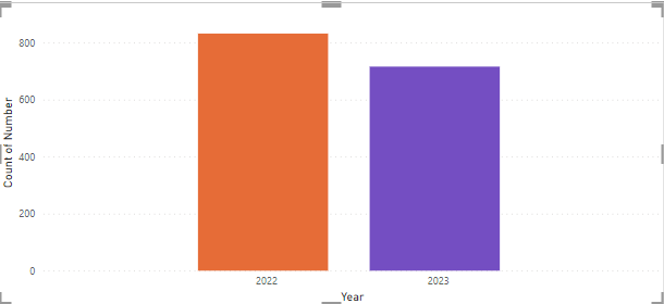
The result:
Interesting Topics
-

Be successfully certified ITIL 4 Managing Professional
Study, study and study, I couldn’t be successfully certified without studying it, if you are interested...
-

Be successfully certified ITIL 4 Strategic Leader
With my ITIL 4 Managing Professional certification (ITIL MP) in the pocket, it was time to go for the...
-

Hide visual and change background color based on selection
Some small tricks to customize the background colour of a text box...
-

Stacked and clustered column chart or double stacked column chart
In excel, I use a lot the combination of clustered and stacked chart...
-

Refresh Power BI
From the Power BI Service, I can set refresh but, for instance, there is no option to do it monthly or each time a change is made...
-

Power BI alerts to be sent by email from an excel file based on condition
I will explain how to send a list of emails from an excel file after creating alerts...


