Power BI: include the slicer as a condition in the calculation
In this article, I will explain how I can add a filter as a criteria for a calculation. I will take also advantage to explain how to resolve some chart issues when I can’t have more than 1 relationship between 2 tables.
Let’s say that I have those 2 tables, the only difference is that in table1 I don’t have the “number” column and in table2, I don’t have the “percentage” one:

This is the relationship between them:

I created 2 charts, one yearly and one monthly with 3 filters:
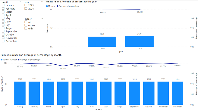
NOTE: to create them, I used data from table1 except for the column which sums the number of incidents from table2
As I can see, the monthly one is not correct about the columns, all have the same number (sum of 2023 and 2024) and for the yearly, it looks OK. Using the slicers, the “month” and the “year” ones seem working correctly but the support one, by selecting “nt”, “unix” or “others”, the numbers are not updated, only the percentage:
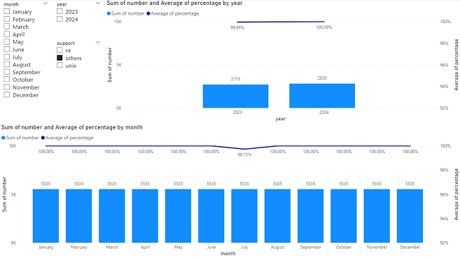
Apparently, I have 2 issues:
- The “number” for the “monthly” chart
- The “support” filter not working for the “number” for both charts
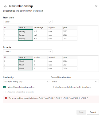
The easier way to resolve them, it will be to create a relationship for those columns between table1 and table2 as I did for the “year” but Power BI will not allow it, no matter which “cross-filter direction” I will choose because of the “year” relationship:
I will begin with the “yearly” chart, first I will create a simple table called “support” like that:
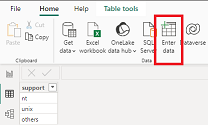
Then I will create a relationship:
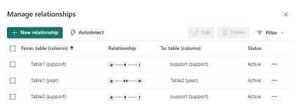
In the table2, I will create a measure with this formula:
CALCULATE(SUM('table1'[argument1]),FILTER('table1','table1'[argument2]=SELECTEDVALUE('table2'[argument2])))

NOTE:
- Change “table1”, “table2”, “argument1” and “argument2” by yours
- I am using “year” because it is for the “yearly” chart
- If I don’t use the FILTER function, it will not work
- The SELECTEDVALUE function should make reference to the slicer data, see the next formula to understand what I mean
From my “yearly” chart, I will change the “column y-axis” data:
 |
 |
And now, it is working as I want:
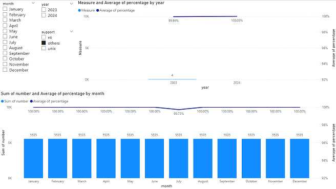
Let’s go to the “monthly” chart, I will create a simple month table like that:

Then I will sort the “month” column correctly like that:

NOTE: if I don’t do that, my charts will not show correctly the month order
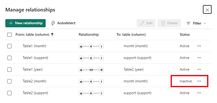
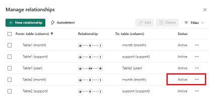
Power BI will create automatically the relationship but I have to make sure that all are “active”:
 |
 |
I will create a new measure using the same formula as above:

As you can see, for this one:
- I make reference to “month” because it is for the “monthly” chart
- For SELECTEDVALUE, I make reference to the “month” table and not “table1” table like the first measure because the “month” slicer will be updated to the “month” table
Going back to the chart:
- In the “month” slicer, I will change from “table1” to “month”
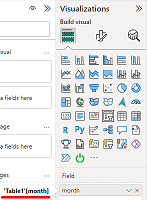 |
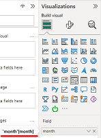 |
- In the “monthly” chart, I will make those changes:
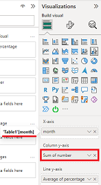 |
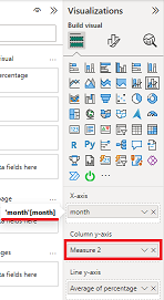 |
As a final result, everything works perfectly.
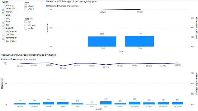
Now to use the drill option, I need to put together the year and the month in the same chart, to show you, I will use the “month” one. First I will create a simple year table like that:

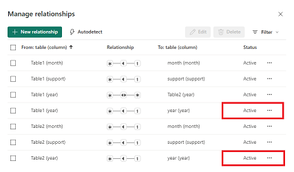
Going back to the relationship making sure that all are “active”:
In the measure 2, I will update my formula by adding the “year” filter:
CALCULATE(SUM('table1'[argument1]),FILTER('table1','table1'[argument2]=SELECTEDVALUE('table2'[argument2])
||'table1'[argument3]=SELECTEDVALUE('table3'[argument3])))

Once done, the only thing I have to do, it is just to update the “month” chart by adding the “year” from the “year” table above “month”:
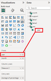
From the chart, by clicking on the “top arrow”, it will show me the year and if I click on the “double down arrow”, I will be back to the month.


Interesting Topics
-

Be successfully certified ITIL 4 Managing Professional
Study, study and study, I couldn’t be successfully certified without studying it, if you are interested...
-

Be successfully certified ITIL 4 Strategic Leader
With my ITIL 4 Managing Professional certification (ITIL MP) in the pocket, it was time to go for the...
-

Hide visual and change background color based on selection
Some small tricks to customize the background colour of a text box...
-

Stacked and clustered column chart or double stacked column chart
In excel, I use a lot the combination of clustered and stacked chart...


