Power BI: interaction between charts (filtering between each others)
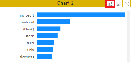
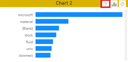
This article is to explain how 2 charts like bar charts can filter between them. For instance, by selectin an option in the chart 1, the chart 2 will only display related results:
 |
 |
There are 2 ways to do it, via the Power Bi Desktop or the Power BI Service by using the “edit interaction” option. For Power BI Desktop:
- 1. Select the chart 1
- 2. Click on format -> edit interactions

- 3. In the chart 2, at the top right, select “filter”

If I want the chart 1 to behave the same way as the chart 2, I will select the chart 2 and on the chart 1, select “filter”. Once done, just save, publish and update the app so the audience can play with it.
For Power BI Service, it is the same thing except that to find the “edit interactions” option:
- 1. Open the report

- 2. Click on “edit”

- 3. Click on “visual interactions” -> turn on “edit interactions”

- 4. Select the chart 1 and on the chart 2, select “filter”

Once done, save and update the app.
Interesting Topics
-

Be successfully certified ITIL 4 Managing Professional
Study, study and study, I couldn’t be successfully certified without studying it, if you are interested...
-

Be successfully certified ITIL 4 Strategic Leader
With my ITIL 4 Managing Professional certification (ITIL MP) in the pocket, it was time to go for the...
-

Hide visual and change background color based on selection
Some small tricks to customize the background colour of a text box...
-

Stacked and clustered column chart or double stacked column chart
In excel, I use a lot the combination of clustered and stacked chart...


